Modernizing a legacy UI
Product: IBM Safer Payments
IBM® Safer Payments enables fraud prevention teams to adapt controls faster to emerging threats and detect fraud with greater speed and accuracy without vendor or data scientist dependencies.
It comprises the analytics and simulation tools needed to continuously monitor business performance and adapt the decision model to emerging and modified fraud patterns.
Company: IBM
Role: UX Design Lead
Timespan: March 2020 - Jan 2021
Team Location: USA, Canada, Germany & India

The UI Modernization Dilemma
The business case
—
In early 2020, Safer Payments has gathered quite a bit of feedback around the new UI. Even to the point that clients are threatening to walk away, business dollars are at risk.
WHY?
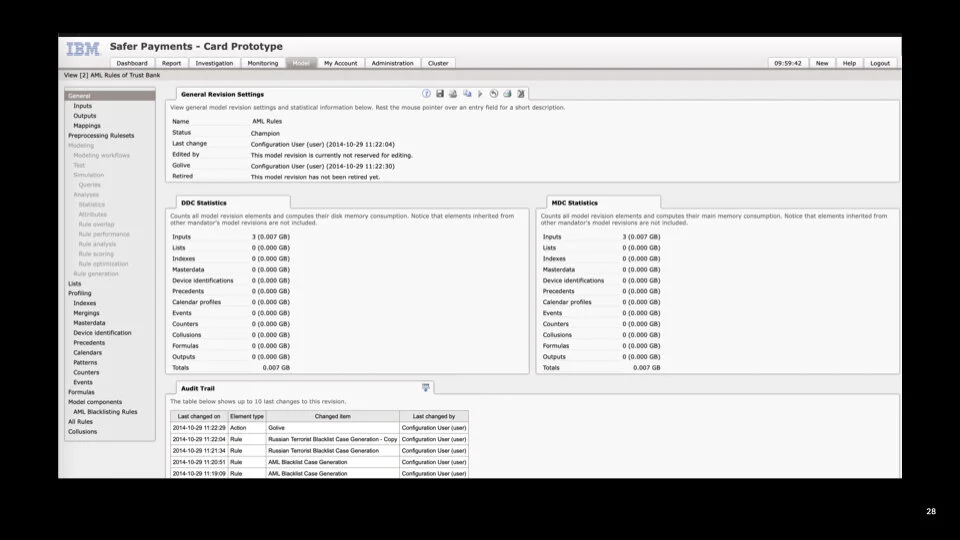
Safer Payments’ legacy UI is beloved by its users, and to their credit, the Development team sought to migrate to Carbon over a two year period.
However, this was done without design involvement or prompting their customer base which was met with much criticism and pushback.

Enter design team
We were initially engaged by our VP’s to help understand the feedback and capture pain points for the development team to take action. Shortly following, we pulled in UX & UI design allocation to drive greater impact and to speed the process along.
Begin user research
—
In collaboration with our stakeholders, we identified a strategically diverse group of customers to work with throughout this initiative.
We were able to engage with a total of 20 participants from the customers identified from North America, Europe and Asia.
Begin UX evaluation
—
Alongside the generative user research we performed an in-depth UX and visual audit of the current Safer Payments interface to identify inconsistencies and to understand the current state of the interface.
From that evaluation we identified core UX issues that needed to be addressed from an UI standards and Carbon perspective.
Contact me to learn more about this research phase.
Finding our path forward
We synthesized the finds from initial sets of generative user research and the UX evaluation indicate the core areas of opportunity to improve the user interface.
Using these three key user pain points there were clear areas where we could improve the UX.


Product team education and learning
In order to make rapid progress on enhancing the user interface so that we could deliver value to our users, we needed to do an education series for the product team to teach them design principles, application, and process frameworks.
Along with that we began an extensive jobs-to-be-done study so that we could begin thinking about what needs be on the strategic roadmap after this initial UI enhancement.
Contact me to learn more about our education series.

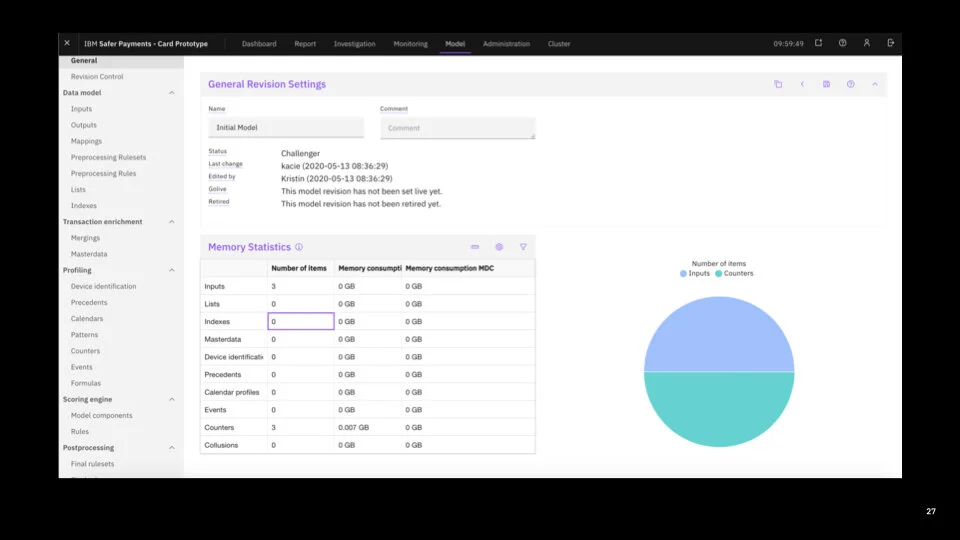
It’s not just about Carbon component adoption
We need to contribute component updates back to Carbon & CD&AI PAL in order to build experiences that help our user and not negatively affect their workflow.
Although the new Safer Payments UI is visually quite attractive, customers feel that it comes off as “too lightweight” for a “productivity” software, and some marquee customers are now contemplating on whether or not to continue moving forward with IBM. After further investigation, this sentiment was driven by lack of layout density and the scale of the Carbon components.
To address this issue we submitted an extensive case study and UI specifications to Carbon to push along compact components for all Carbon form fields, accordions and the structured lists. Due to our strong business case, along with many other products that needed the compact components, Carbon updated their components and we are now able to build more data dense interfaces.
End results
We were able to adopt all new design standards across the 50+ page UI within 8 months and will release to go to GA in November of 2021.
Contact me to see more examples of layout transformation.